The Introduction
Threadie is a creative retail brand offering custom thread-art and collaborative artist pieces, based in Pakistan. This project captures the full identity system—logo, visuals, and brand voice—for a store built for expression, craft, and community.
The Challenge
Build a brand identity that instantly communicates craft, personalization, and creative connection. The store needed strong visual impact and clear versatility across print, packaging, online storefront, and social-media touchpoints.
The Color Essence:
Traditional manuscripts inspire the palette. The deep green represents life and spirituality, while the gold accents signify the value of the knowledge being shared.
Visual System & Monogram:
Core themes:
- Craft: Visual cues that reflect thread, needle, and hand-made origins
- Bold Colour: Injecting energy and character into each touchpoint
- Community: Building a visual system that supports artist-collabs and dynamic visuals
The brand mark, typography, and colour palette were developed to reflect both the physical craft and digital storefront.
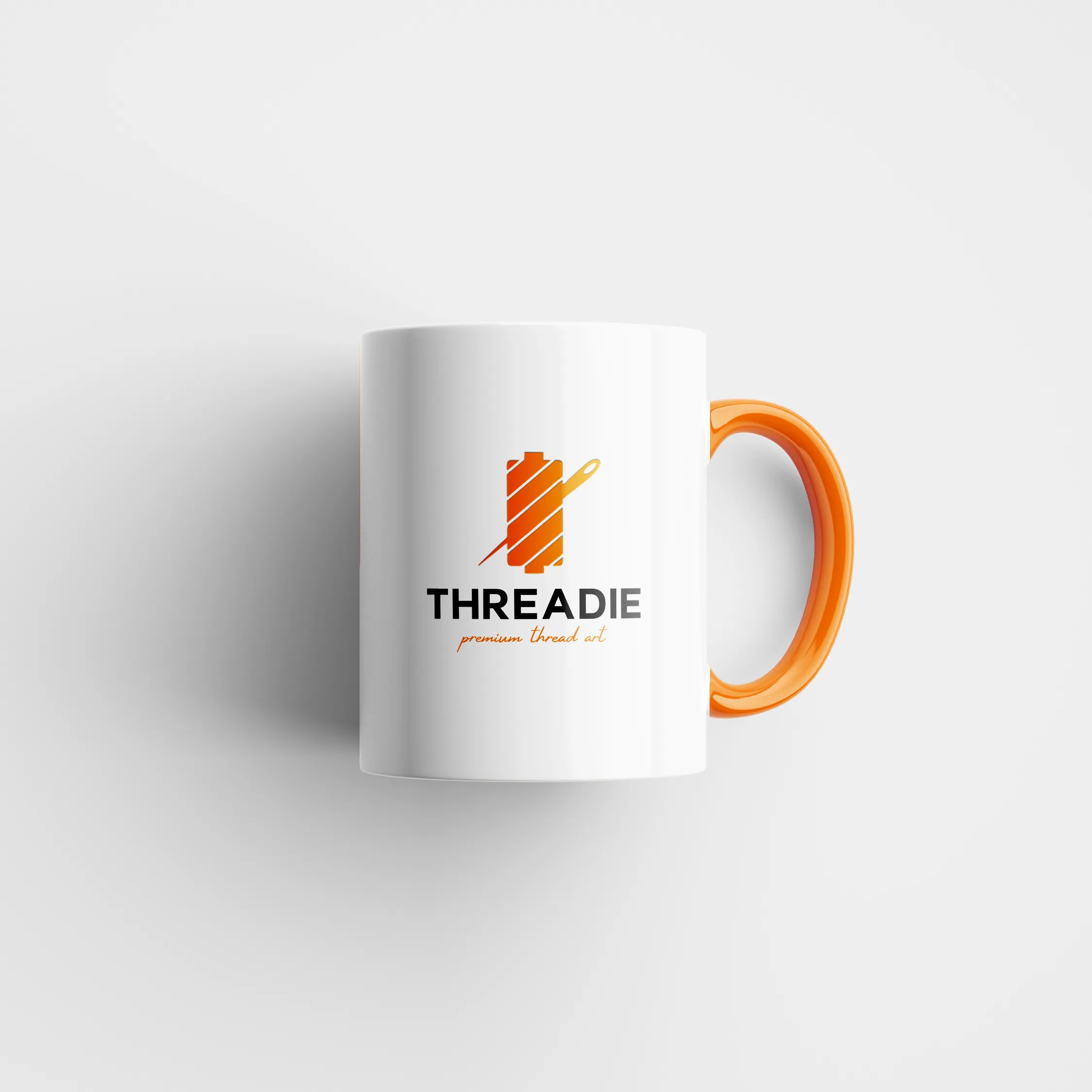
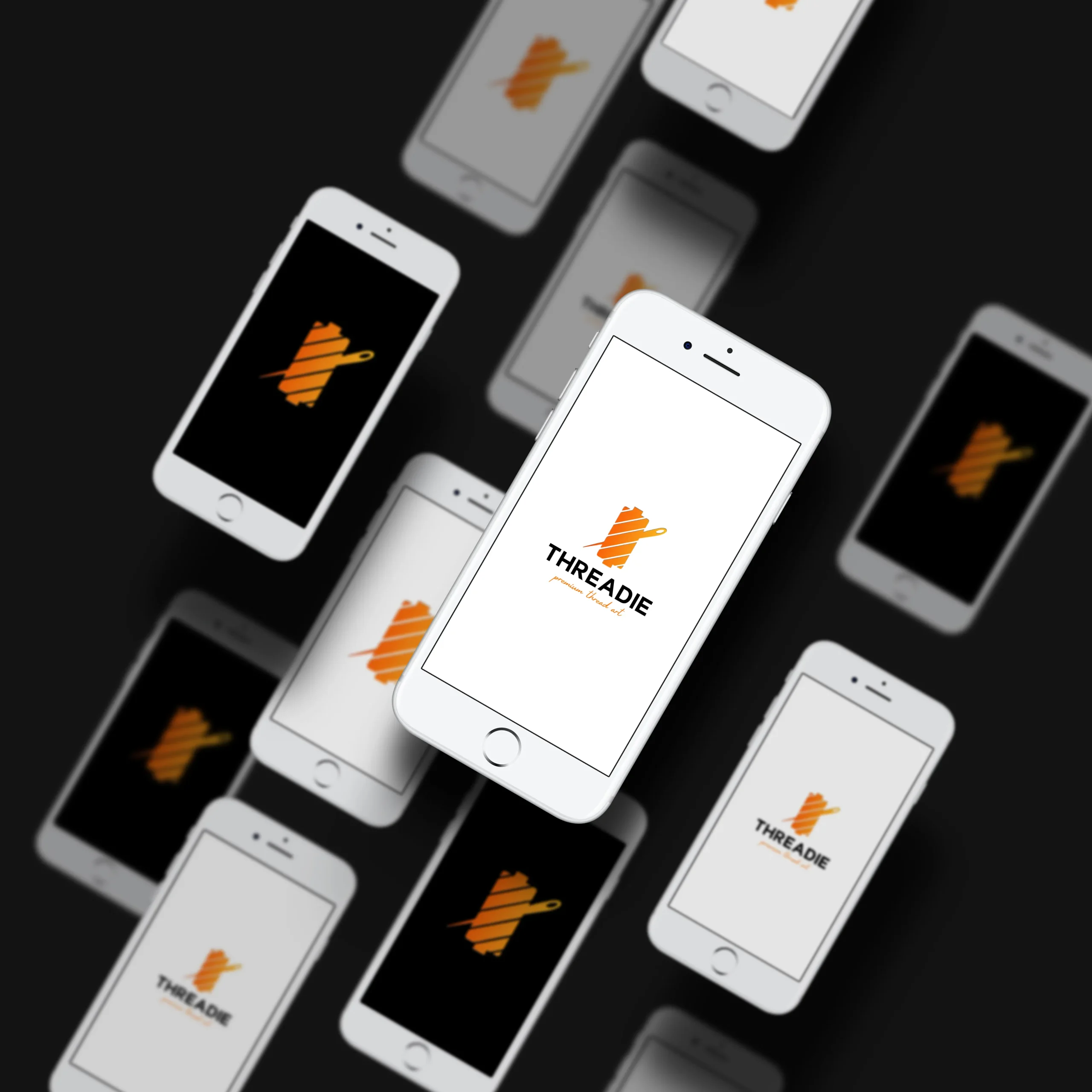
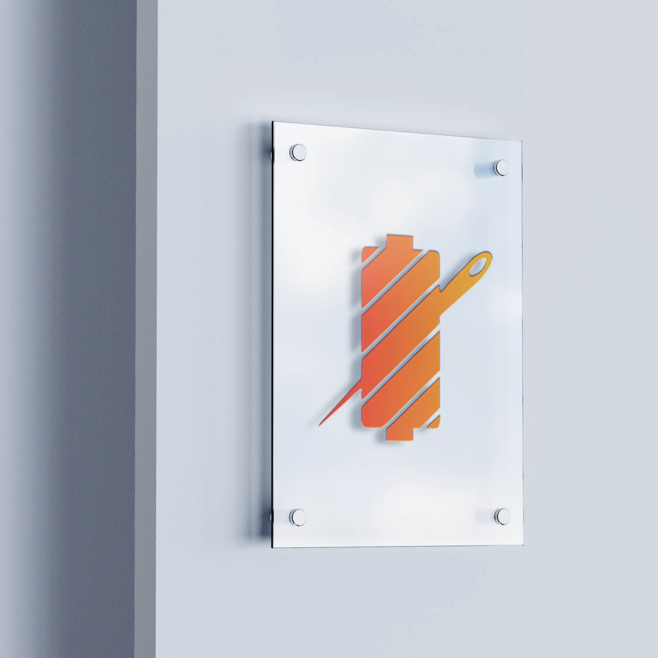
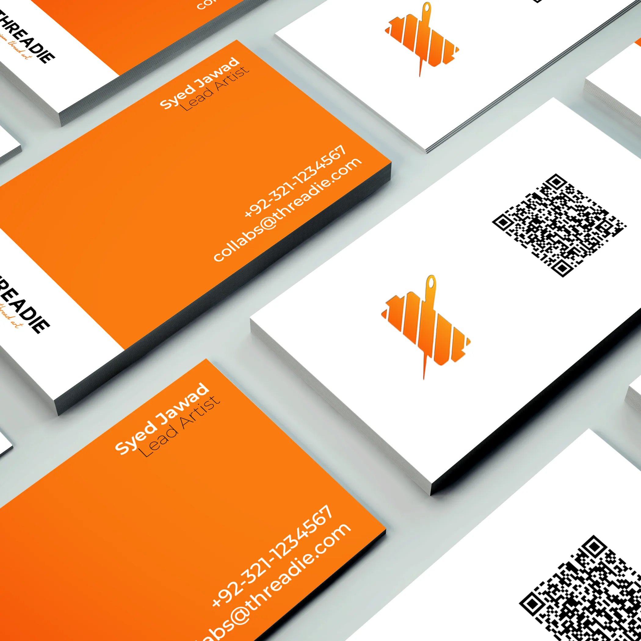
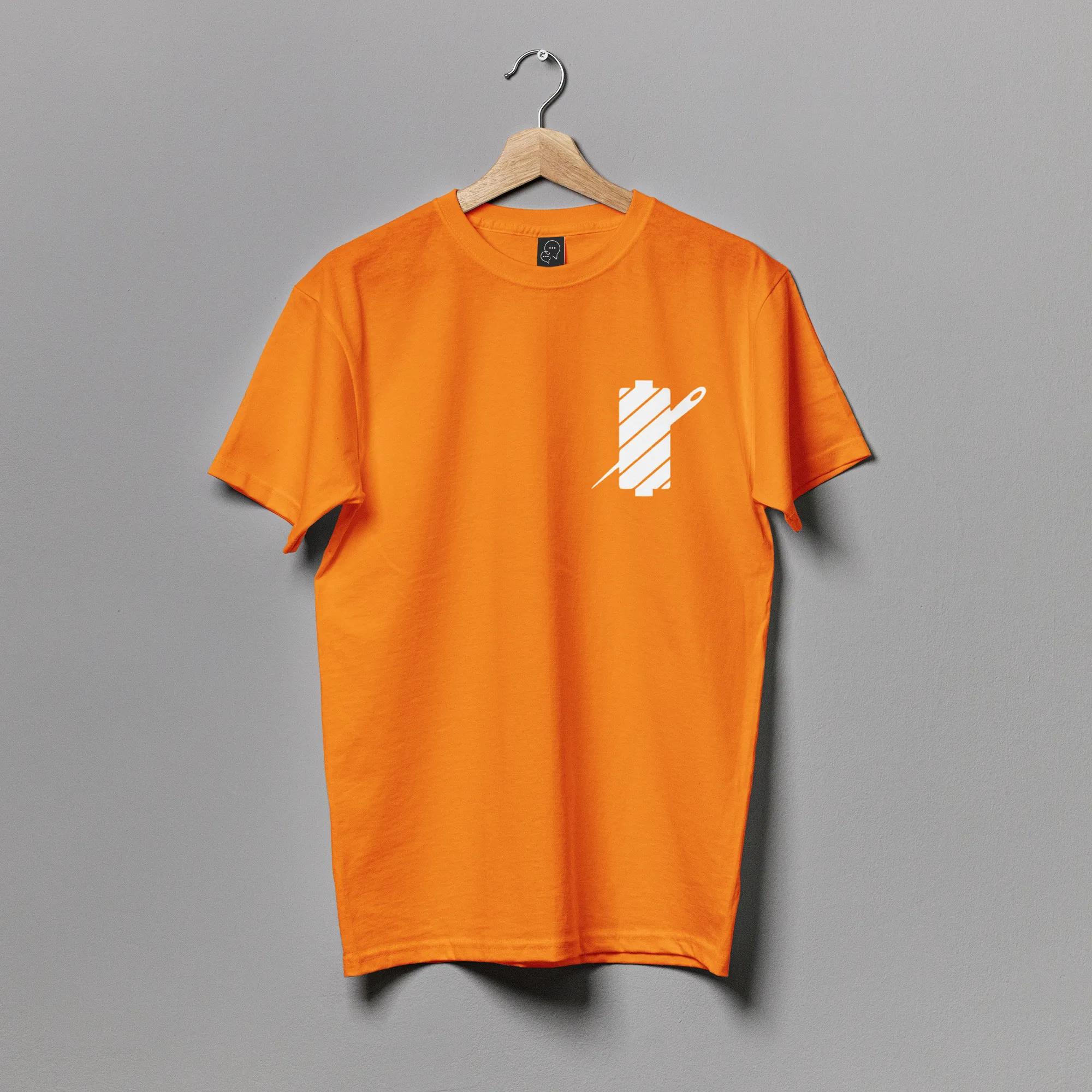
Logo & Identity Elements
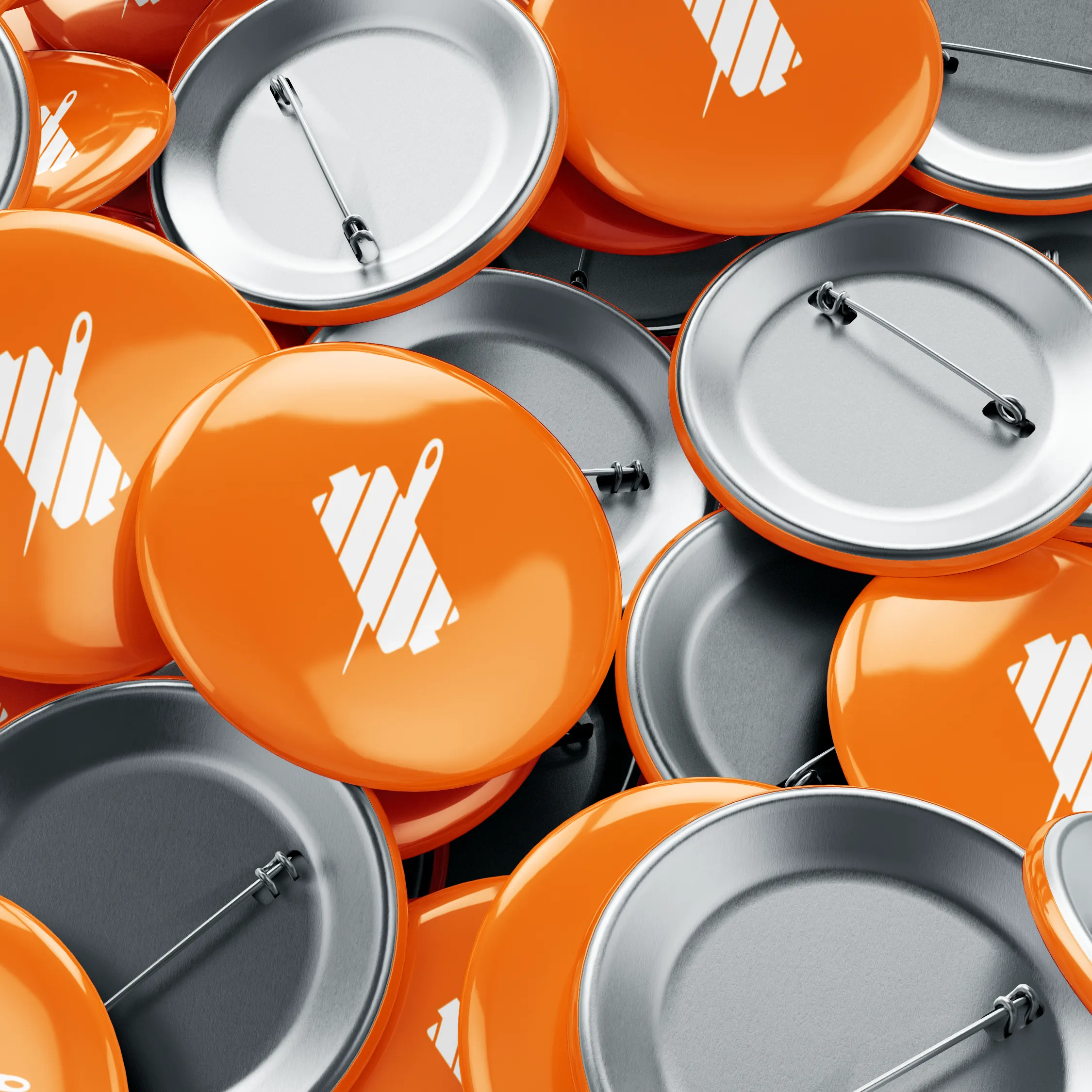
The logo integrates thread-needle motifs and energetic lines to reflect motion and craft. The visual system includes iconography, pattern motifs inspired by stitching, and versatile typography combinations.
Colour palette moves from vibrant accent tones to grounded neutrals to ensure both pop on social and clarity in print.
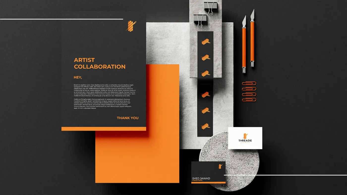
Application & Touchpoints
The identity was extended to:
- Signage and in-store assets
- Packaging and label design for thread-art kits
- Social-media templates and artist-collab visuals
- Online storefront hero images and UI components
Each application reinforces Threadie’s personality and creative promise.
Outcome:
A cohesive brand system that stands out in the handmade-art retail space and supports future growth in both local and digital markets. Threadie now presents as bold, creative, and connected.