The Introduction
Persia Consultancy Group is a business advisory firm specializing in facilitating international trade and corporate relations between Iran and Pakistan. The project involved complete brand identity design, aimed at creating a modern, credible, and cross-cultural visual system that reflects professionalism and regional connectivity.
The Objective:
To design a corporate identity that communicates trust, authority, and clarity in the global consultancy space. The brand needed to balance modern aesthetics with regional authenticity, projecting confidence to both Middle Eastern and South Asian markets.
The Creative Direction:
The identity draws inspiration from the concept of connection — economic, cultural, and strategic. The logo design uses geometric precision to represent structure and stability, key attributes of international consultancy work.
The Logo Design:
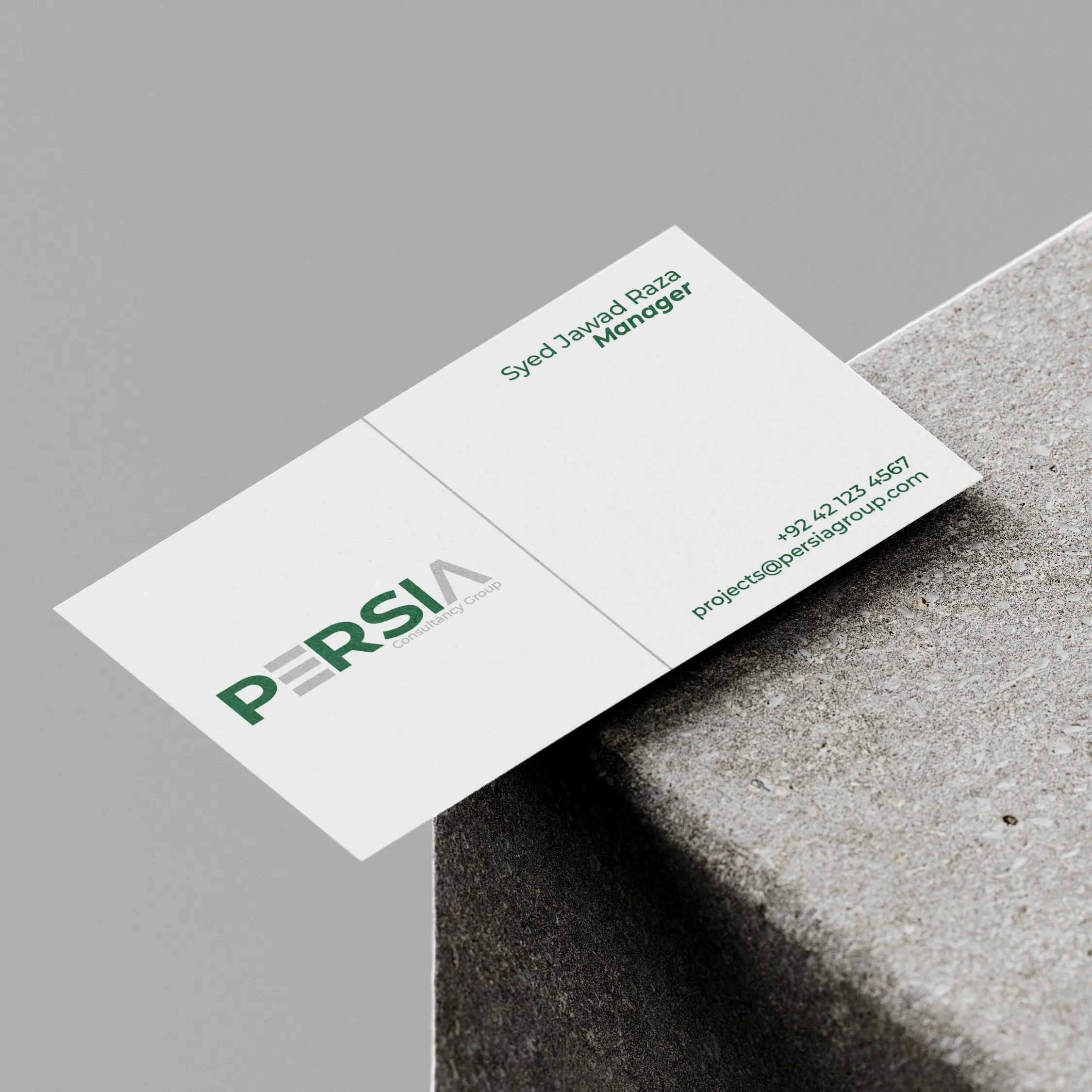
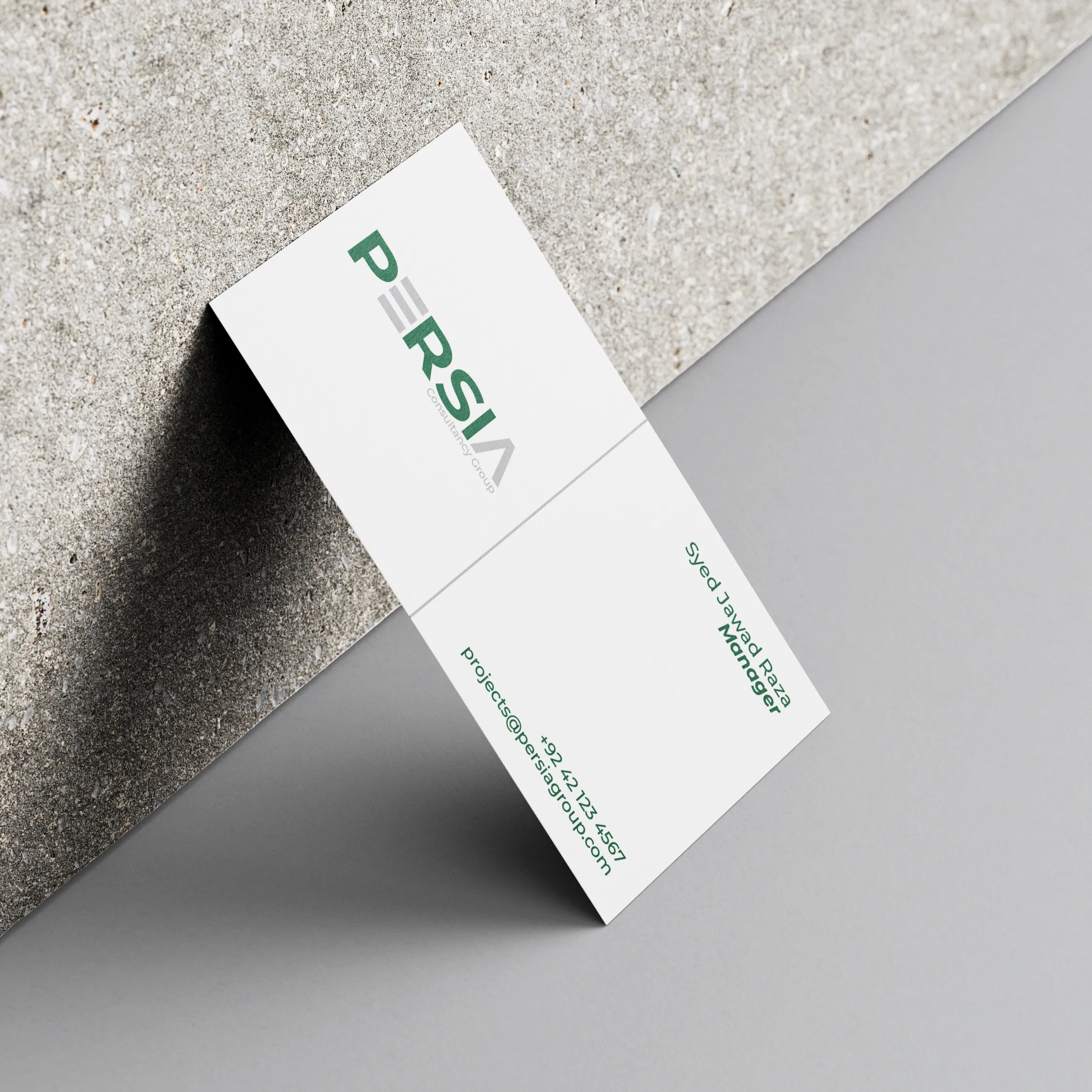
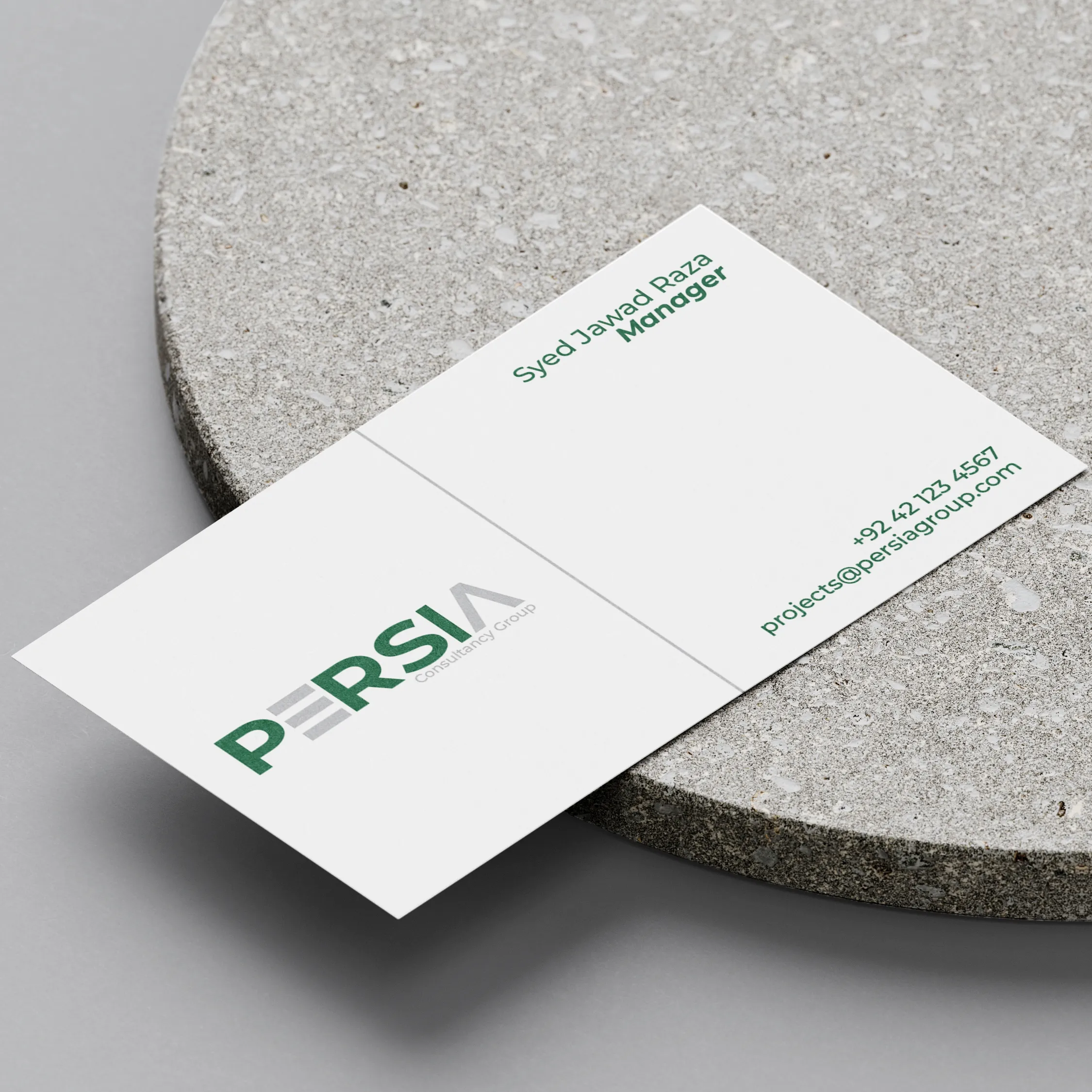
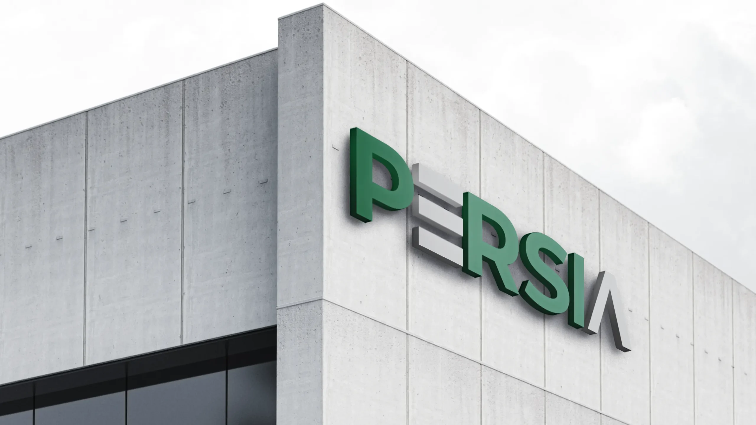
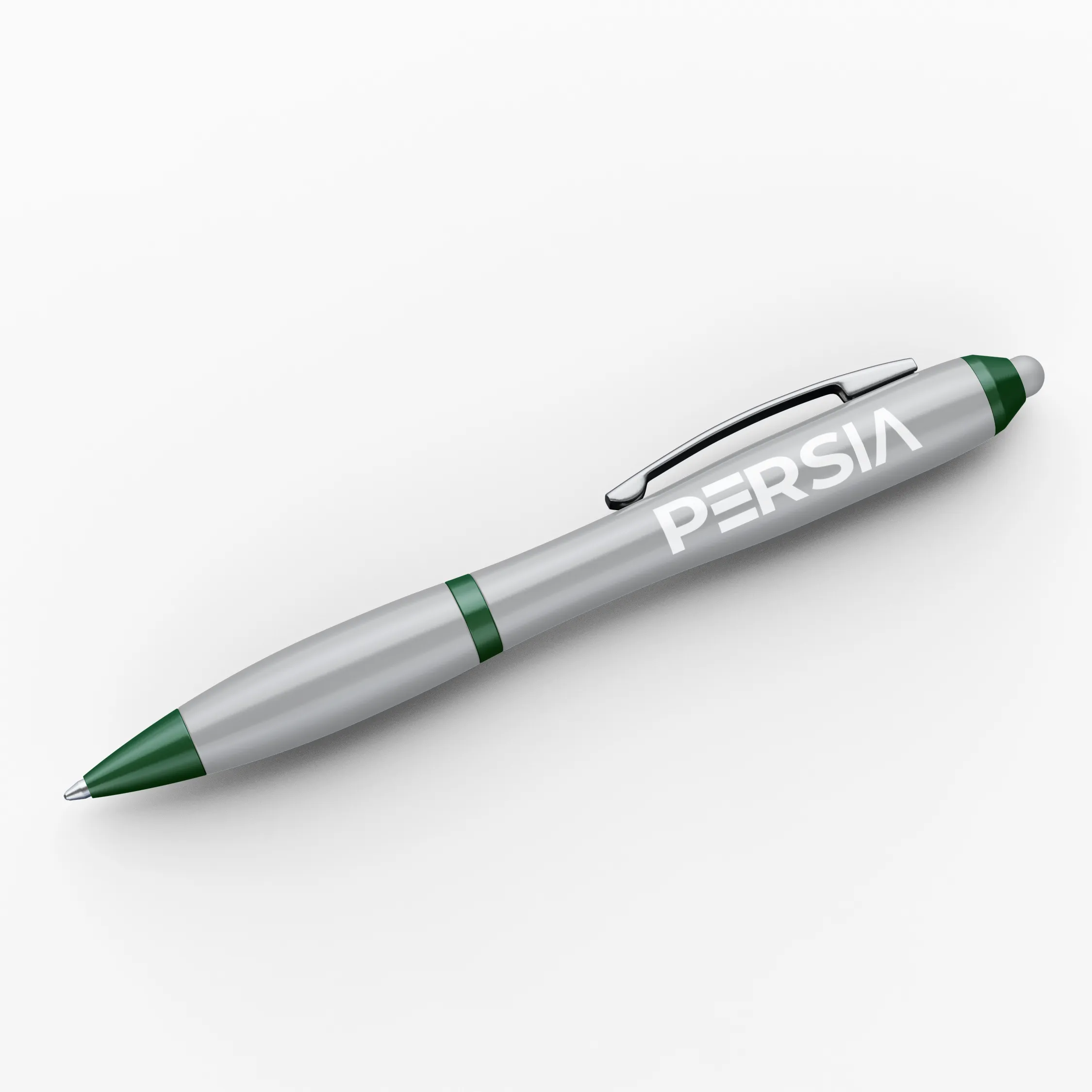
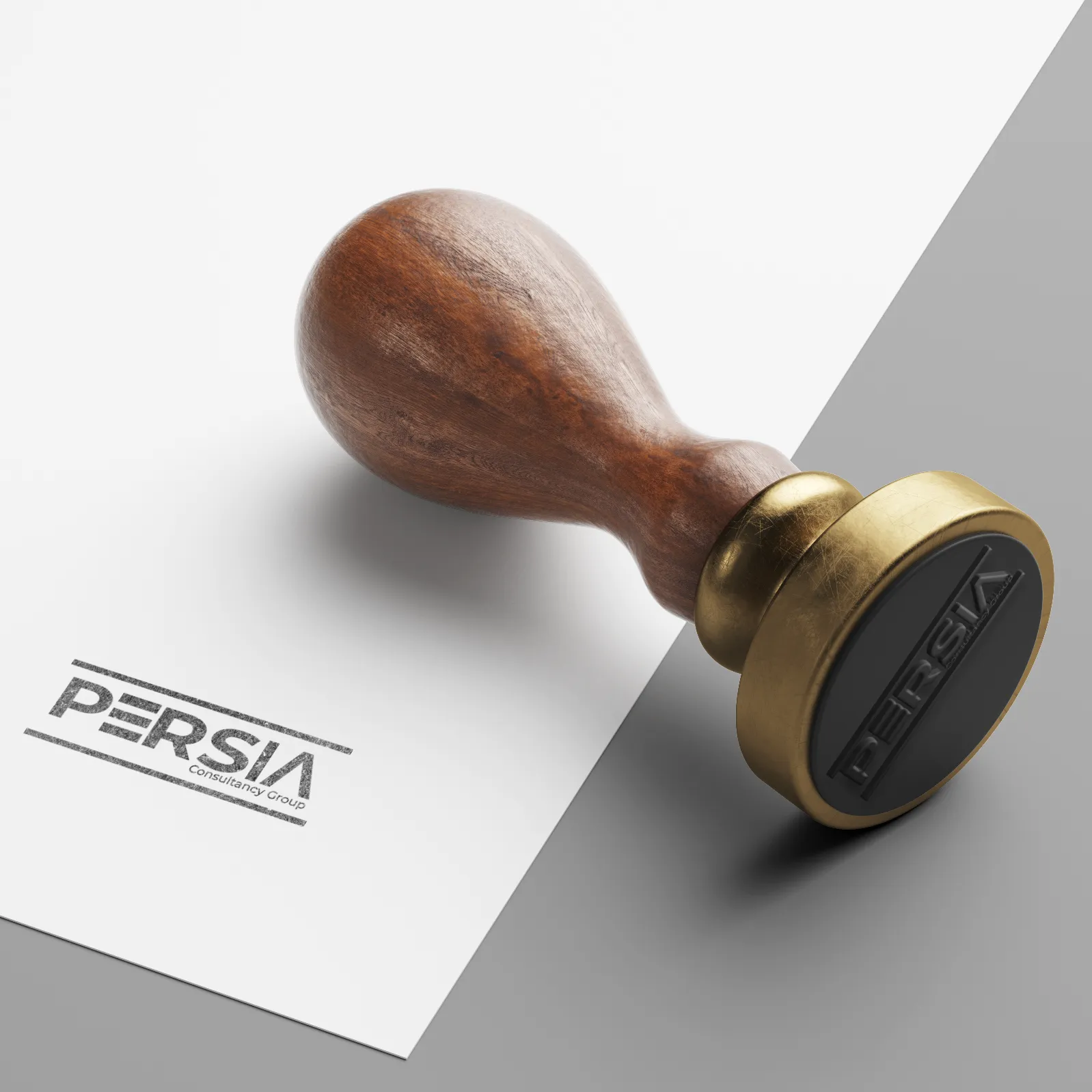
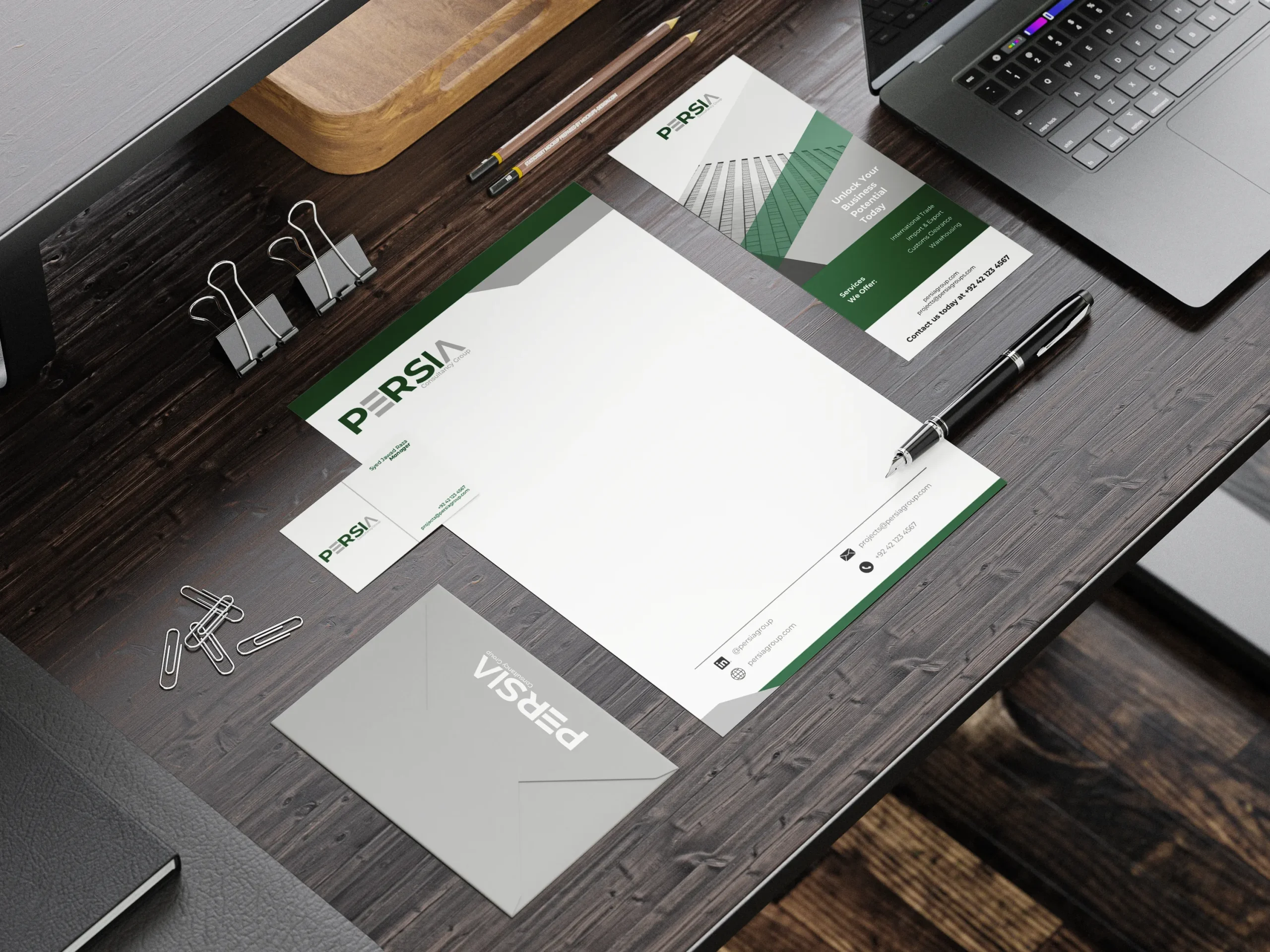
The wordmark “PERSIA” integrates bold typography with a distinct central element: three horizontal bars within the letter E symbolizing trade routes, balance, and exchange. The letter A is stylized as an ascending form, suggesting progress and partnership.
The Color Palette:
Deep green and neutral gray were selected to represent growth, wisdom, and neutrality. Together, they convey credibility and calm authority, suitable for a cross-border professional brand.
The Typography:
Modern sans-serif fonts maintain readability and reinforce the clean, structured brand image.
Brand Language:
Every element, from logo spacing to wordmark proportions, was developed to align with the values of clarity, collaboration, and forward movement.