The Introduction
Markaz Al-Ma’arif (The Center of Knowledge) required a visual identity that bridges the gap between historical Islamic scholarship and contemporary educational standards. The goal was to develop a brand that feels authoritative yet accessible, rooted in the slogan: “Quran & Ahl-e-Bait.”
Typographic Construction:
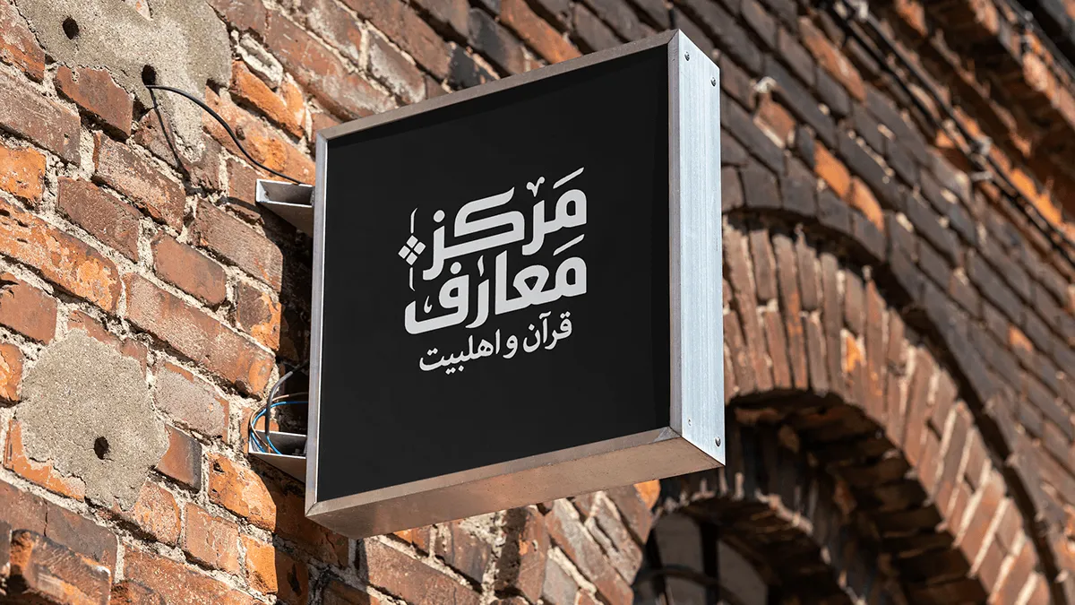
At the heart of the identity is a custom-constructed Kufic script. By utilizing a strict geometric grid, we ensured the word “Ma’arif” functions as both a legible title and a structural icon.
The Color Essence:
Traditional manuscripts inspire the palette. The deep green represents life and spirituality, while the gold accents signify the value of the knowledge being shared.
Visual System & Monogram:
For secondary applications, we developed a simplified monogram and a repeating pattern. This allows the brand to remain recognizable even at a 2cm scale, ideal for watermarks and textures.
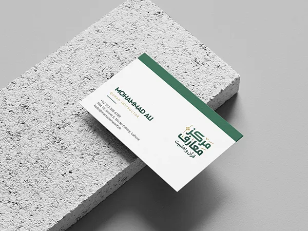
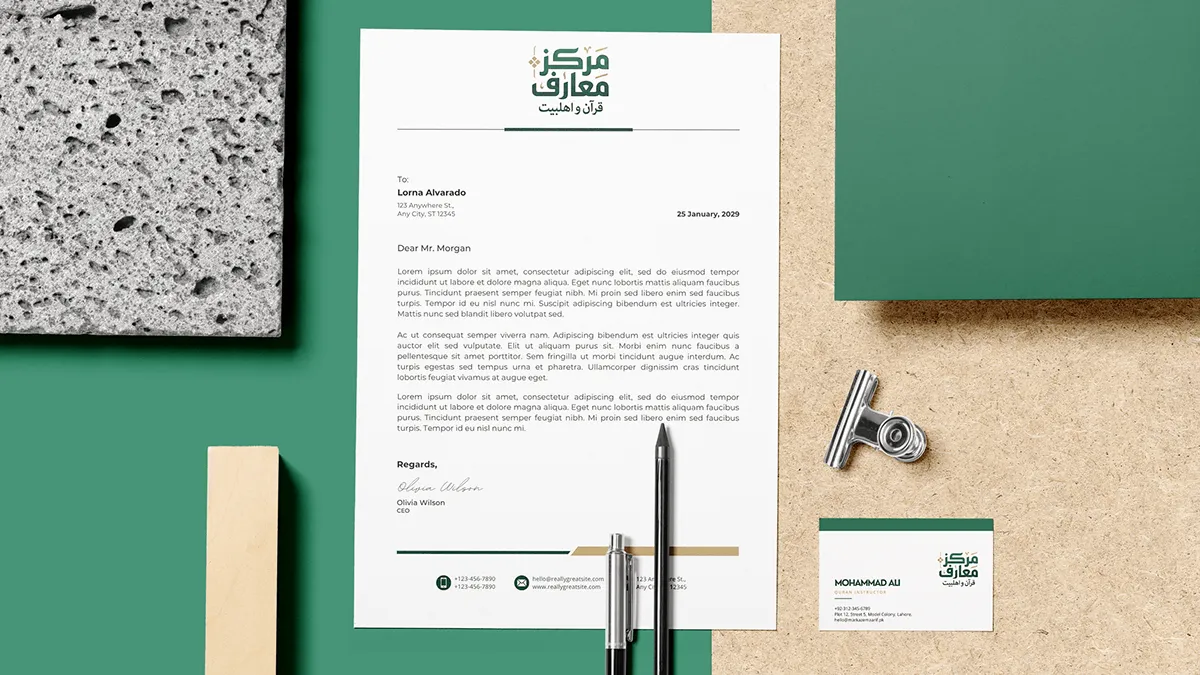
Stationery & Physical Touchpoints:
A brand is only as strong as its execution. We extended the identity to official stationery, focusing on a clean, professional layout that allows the typography to breathe. The use of a physical rubber stamp adds an element of authenticity and tradition to the school’s documentation.
Brand Guidelines Summary:
A cohesive system designed for consistency across all digital and print media.